Project Structure
In collaboration with the client we planned and facilitated the three different sections to be designed. We analyzed customer feedback and defined the UX challenges.
Sitemap of the three sections.
“CICERO Has A National Role In Promoting Knowledge About Climate Change And Is Internationally Recognised As A Driving Force For Innovative Climate Communication. ”
Explore: desktop layout ideation
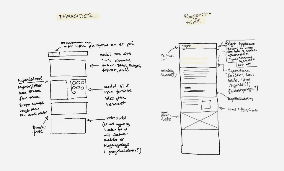
Desktop wireframe ideas establishing visual hierarchy and layout constraints.
Adapt: responsive design iterations
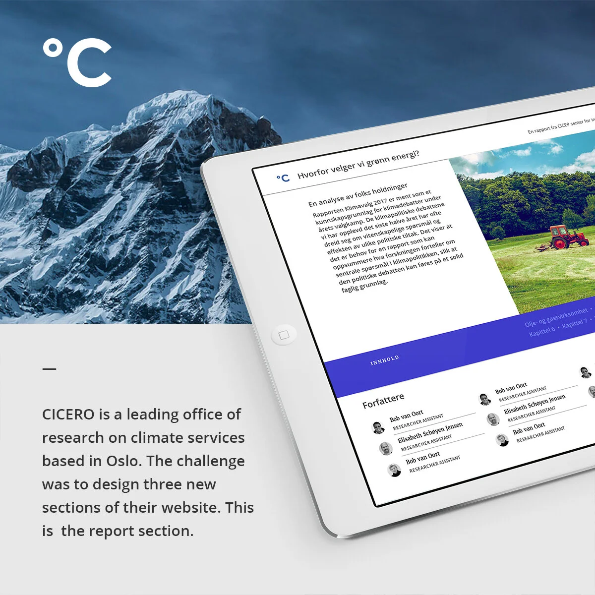
The biggest UX challenge was to fit the clients ideas and the users needs to the existing CICERO framework. The idèa for the online report was to provide users with one long article-like page divided by chapters. The second major UX challenge was ensuring a simple and usable navigation experience on every screen.
Wireframes for mobile, tablet and desktop adapting content flow across breakpoints.
Fixed sticky navigation bar for desktop improving chapter navigation consistency. Iterations for mobile.
Refine: navigation interaction behavior
To ensure a consistent experience for all users, every piece of content needed to be fully accessible on desktop and mobile. To move between the content, users can navigate via the blue menu which is differentiated from the other two menus on the web site. On the desktop version we created a fixed sticky navigation bar to grab attention for navigation between chapters while scrolling.
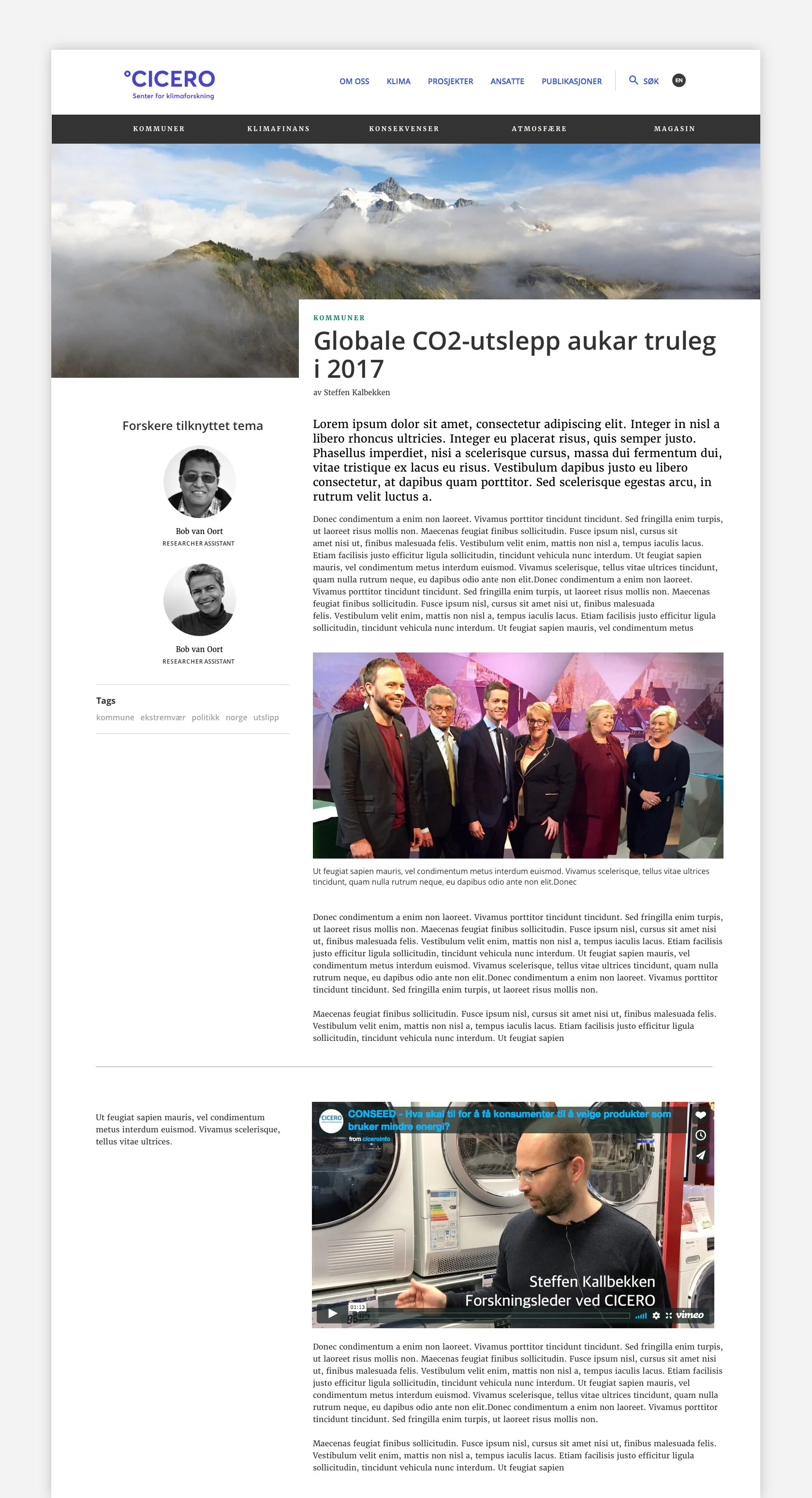
Theme pages
Mobile prototype
UX challenges
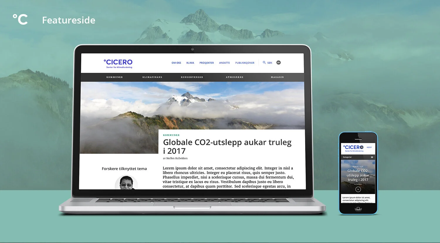
The content strategy was the first major UX obstacle. We had to adopt old sections into new modules while at the same time give way for new design ideas. We had to find clever solutions to differentiate six category pages within one new theme page section while ensuring a simple and usable navigation experience on every screen.
UX solutions
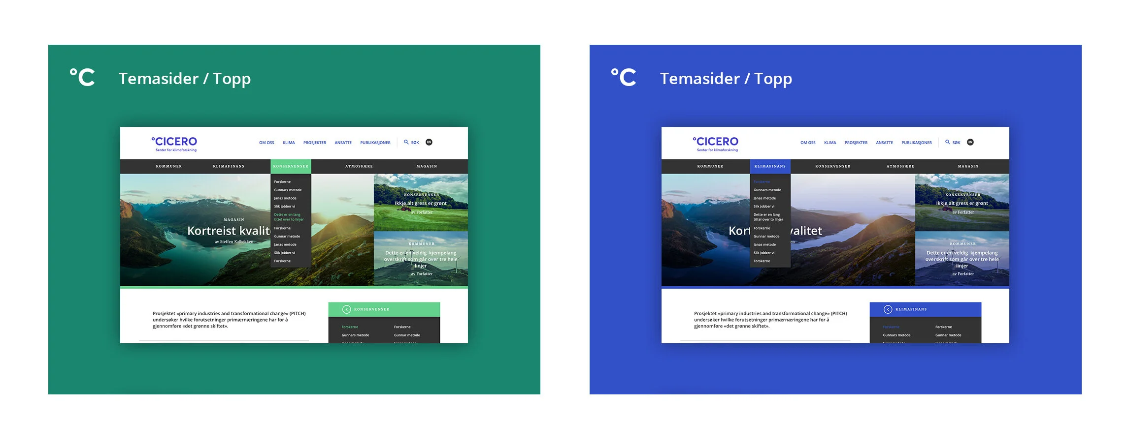
The theme pages consist of six category pages placed in a black menu to stand out at the top of the page. To differentiate the categories, each category got its own color scheme. The categories are Climate Finance, Climate Policy, Climate System, Impacts, Locale Solutions and Mitigation.
When scrolling over the images with the mouse pointer, the color strip is removed and the picture is clearer, even with a zoom function. This is to indicate where the user is and to draw attention to the content. This was a solution we discussed early on as the coding already was there, just to be customized for the theme pages.
Featured Articles Module


