A consistent user experience was provided on different screen sizes.
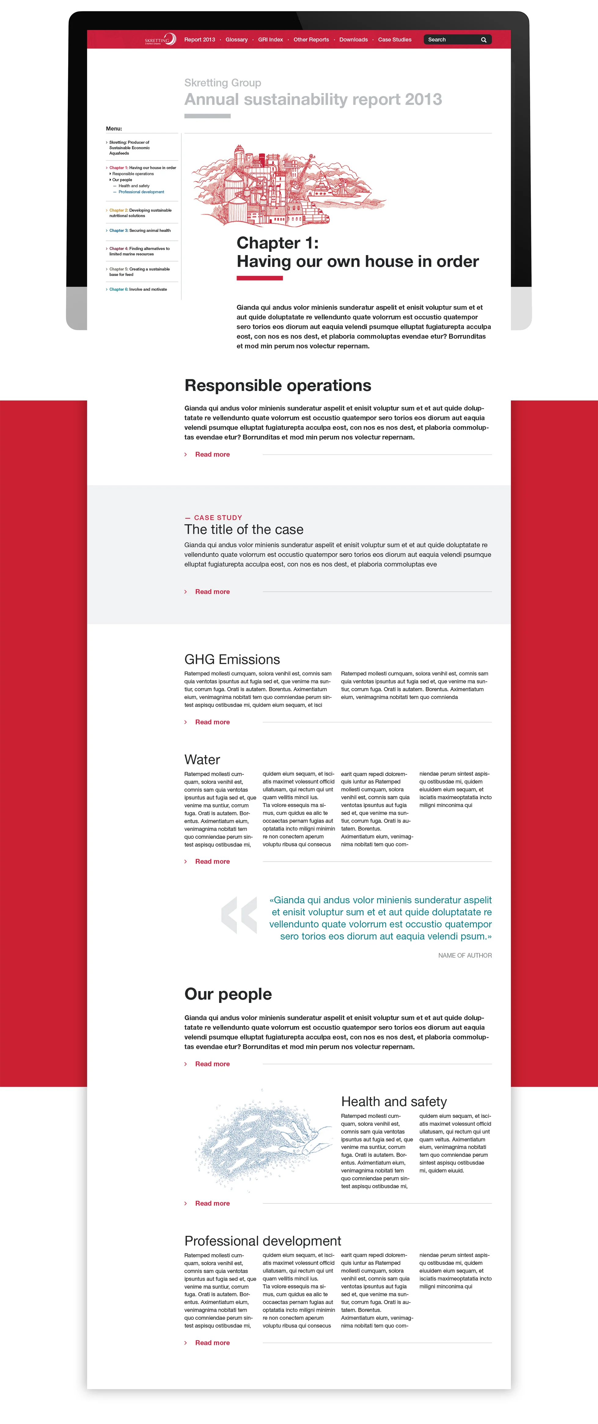
Interactive platform
In close collaboration with the Skretting team, we were involved in user research, content strategy, design and development. We created wire frames and sketched out ideas of functionality based on user research from the client.
Sitemap of the interactive report.
Concept sketches and storyboards on data information.
UX challenges
The biggest challenge was to structure all the content in a dynamic, well presented and flexible way. The overall story should be prominent while having the opportunity to dig deeper into the details. We wanted the users to be presented to a summarized version while having the opportunity to dig deeper into data, graphs and tables. The report consists of 6 chapters.
Wire-frames

Early stages of the interactive side navigation.
UX Solutions
A prominent UX solution was the side-menu which work like the index page in a book. It gives the user the opportunity to easily navigate between the chapters and its content. The content was designed in a flexible grid for various layout possibilities. This made for exciting storytelling with the opportunity to extend and access more information with every new sub category.
Iterations of animated information graphics to be used in the report.

To bring focus to the content a collapsed menu appears when scrolling.
Printed reports
A shortened printed version were made as a supplement document. One for the global market, one for the Australian market, one for the Norwegian and one for the Chilean market.