
“I´ve had a lot of surreal moments listening to my iPod and watching the world around me … It´s almost like watching a movie, but your in it. (Jason)”
Analysis & thoughts on improvement
The Mimi music app, website and Social Media should reflect the brand and its users. The brand is a bit limited so a b(r)andaid and thoughts on design is needed in order to achieve the goals we set out and for everyone to have a common ground.
Thoughts: My experience of using the mimi technology blew my mind. I was very pleased to see it clearly enhancing my experience of my favorite music. I think it would be interesting to refine the most relevant aspects of the brand book and to create a coherent visual language for the apps (iconography & UI), the mimi web site and for Social Media. User research and defining personas in a customer journey will be relevant to redesigning the web site.

Ideas for further discussions
Based on this analysis, Ive done some exercises to provoke ideas for further discussions. This will work as a foundation for a redesign of the Mimi Web Site. Visual consistency is important and I think the solution linger in the overall user experience- and the user interface design in its correlation to the brand book.

Personas


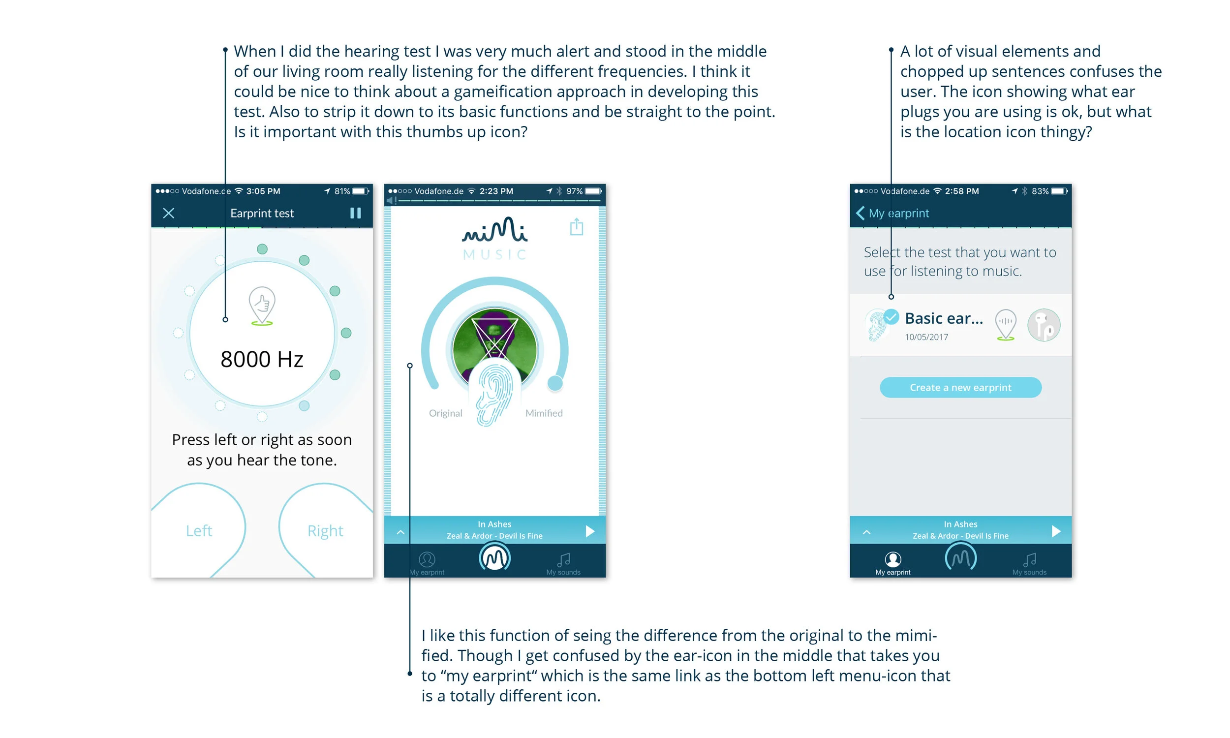
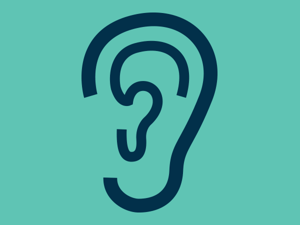
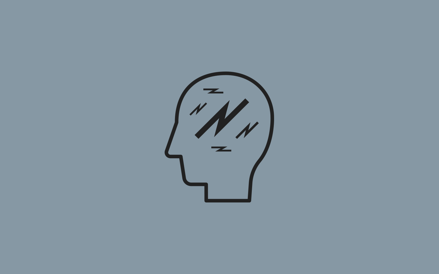
UX Challenges
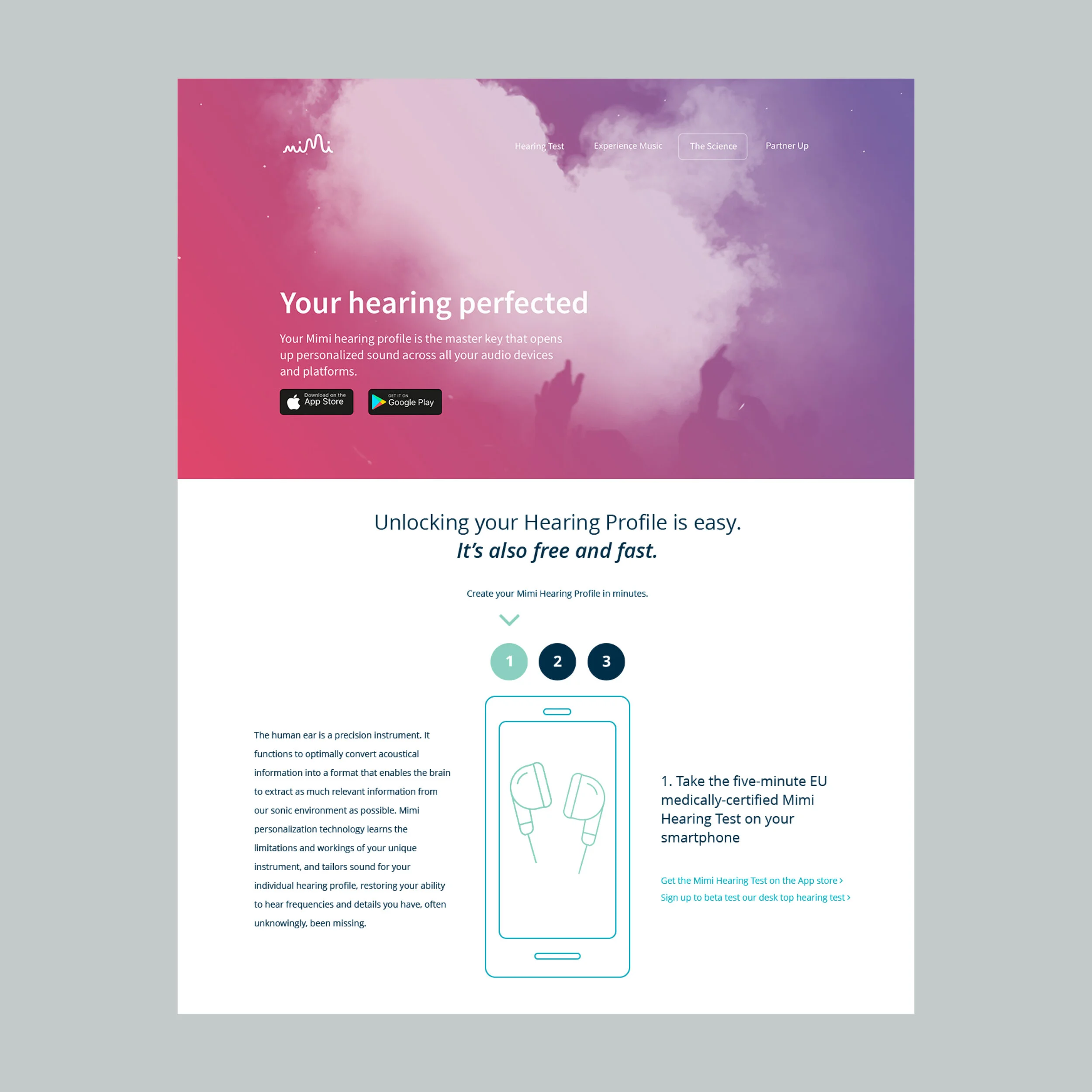
Present a new engaging website based on new content to the current framework. The work was designed alongside ongoing discussions on brand updates and customer research. I worked closely with the developer to address the limitations of a redesign. New thoughts on branding, typography and the grid gave room for a more consistent and flexible layout.

We extended the colour palette to bring more energy and emotions like sensitivity and humor to the overall communication.
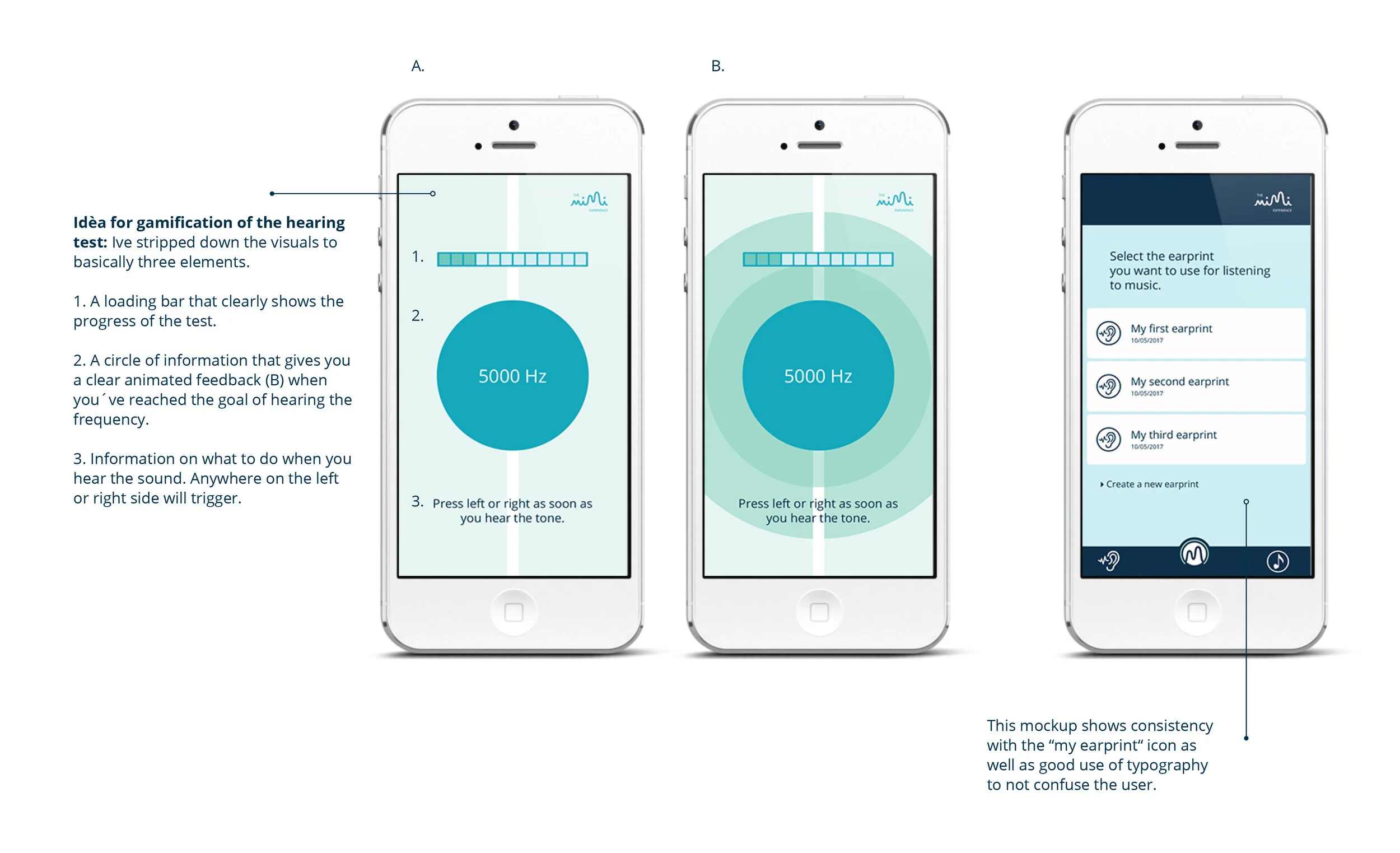
UX Sollution
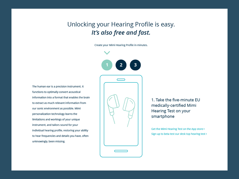
Colourful, exciting imagery was created to draw attention and to resemble emotions when listening to music. The design reflects the brands tone of voice in being bold and edgy but precise. We ensured a great experience for the user on desktop and mobile. The layout is minimal and straight to the point without complicated paragraphs and language. A minimal approach to design with use of white space, minimal icons and an overall light typography became the balance of the new web

Tablet A/B-testing.
Iterations on minimal iconography.
Design of front page
Minimalism

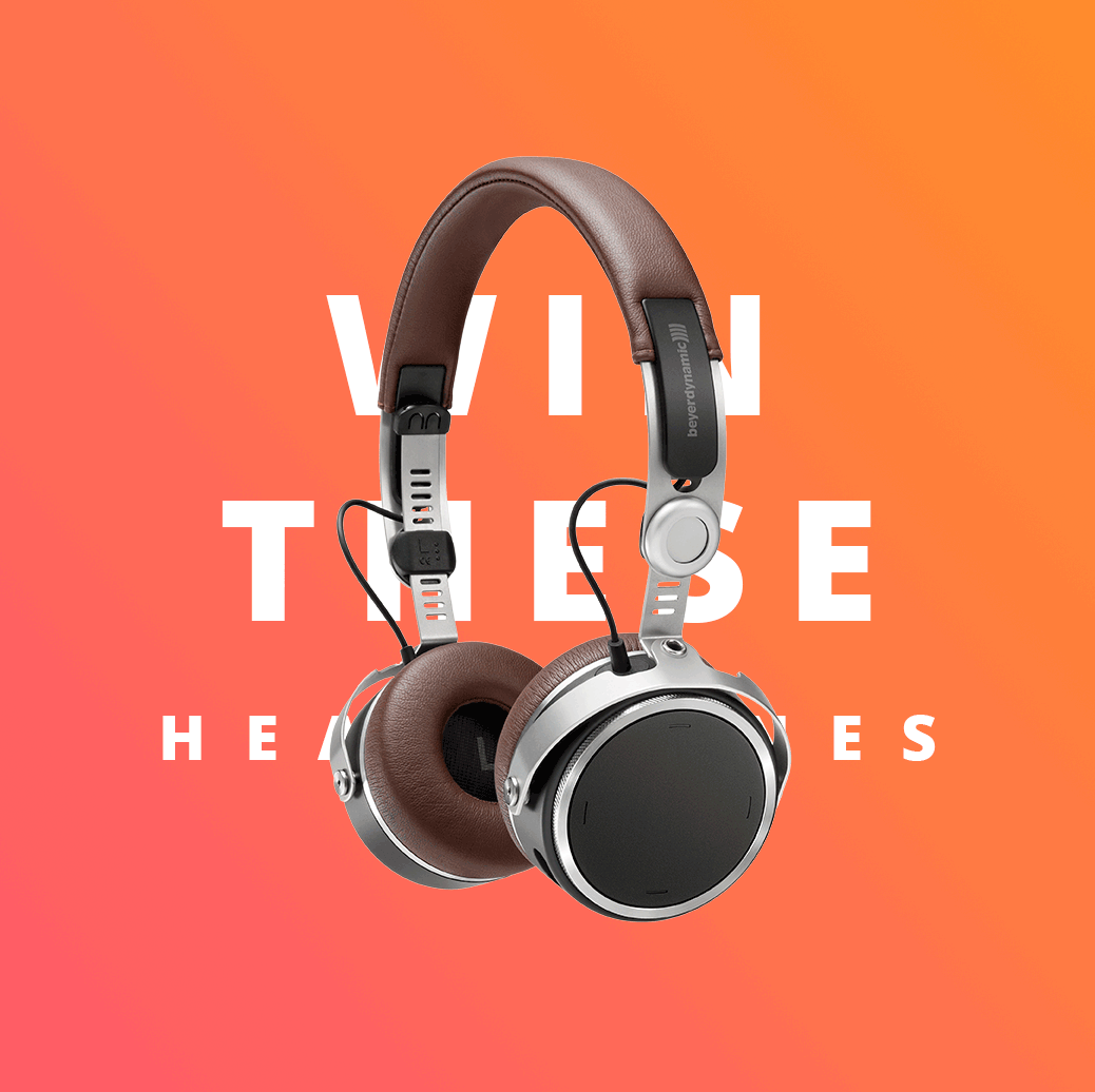
Beyerdynamic + Mimi
Alongside of working with the website and SoMe I attended weekly meetings to contribute in the development of the MIY-app-integration of the Mimi Hearing technology for the Aventho headphones by Beyerdynamic. This is the landing page.

Hearing profile page
Animations

We experimented with simple, clean and vibrant visuals to draw attention in Social Media.